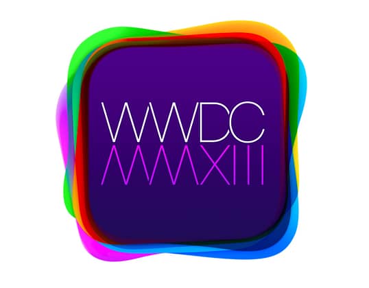
Yes, only 21 days to go until we will be in San Francisco soaking up on our Apple knowledge at the WWDC conference. We can’t express how excited we are to see what Apple has to unveil; we have our sights set on the new Mac pro.
Amongst our excitement, we’ve taken an interest into the WWDC logo, it looks rather peculiar doesn’t it? Here at GEEX, we’ve been trying to identify how the geniuses at Apple came up with such an alluring logo. Some suggest that logo is a clever hint as to what we can expect from Apple. The logo itself shares the rounded square shape of the puck but if you look closely at the colours behind the purple square, they include red, green, orange and blue – the exact colours found on another familiar logo, TiVo. So could it be that Apple are to introduce a collaboration with TiVO, or furthermore their own version of TiVo?
That’s just our thoughts on it, who knows what Apples got install for us. For all we know, the Roman numerals could suggest an iWatch. Haha, we do have very imaginative minds here at GEEX. Follow us on twitter and keep updated with our blog as we’ll be sharing all the gossip from the WWDC conference. We better get packing!
